
Silhouettes -- even today, this may be the first thing
that comes to mind...
Of course, there is a long tradition...
Strikingly iPod-esque
(Christian Pierot)
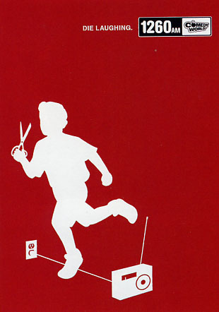
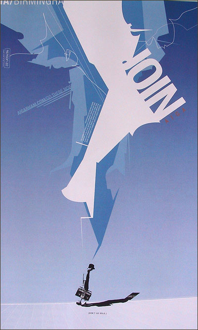
Note the use of space in a piece like this,
we get the sense of movement, the figure
is actually leaving the frame
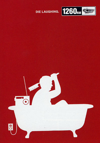
The weight of the tub brings is to the bottom,
and the plug is very subtle -- it challenges you to
actually "find" it!
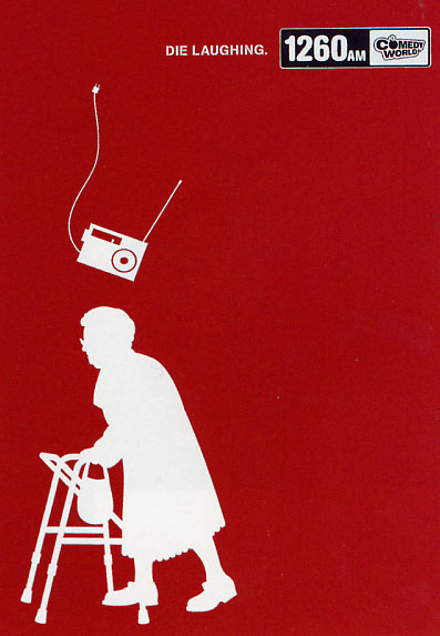
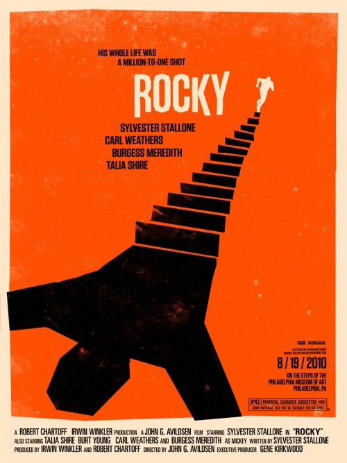
Again, the framing here is the key, along with the cord
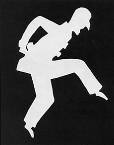
With the figure on the left, we have a "happenstance"
moment -- it's a vector "snapshot"
Framing in this project can do quite a lot!
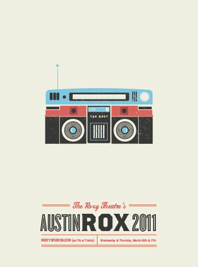
The cord suggests movement -- the radio
is clearly "falling"
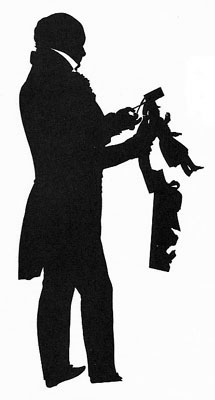
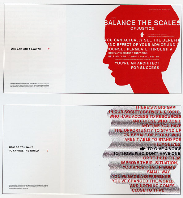
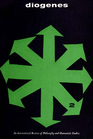
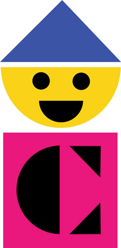
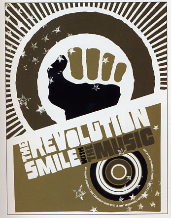
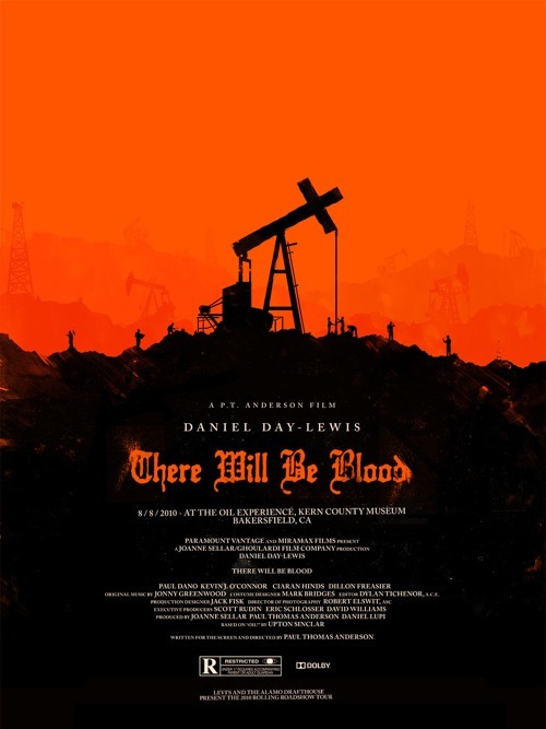
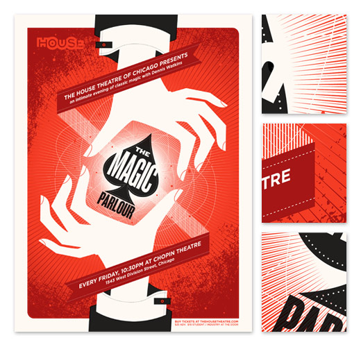
Silhouettes can be ornate, expressive, and can convey
a compelling sense of depth
Note the negative space with the collar!


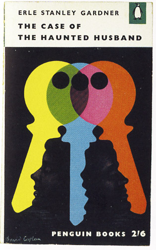
Even in these simple signs, a story is told on two levels
The negative space adds a sense of depth, conveys "overlap"
and adds to the diversity of the design
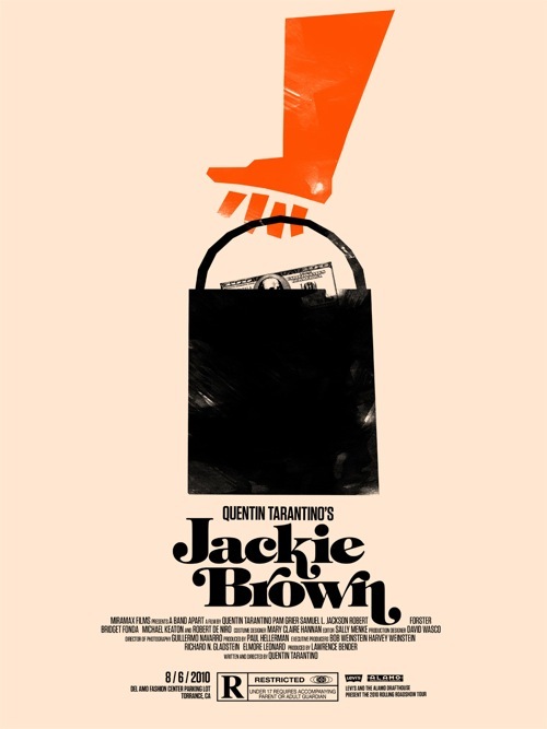
Consider how you might create images that play
with foreground and background relationships
The "figure" and the "ground"
Compelling use of type -- cut from a shape, and "masking" a shape
Also note the framing -- how would this play out over frames?
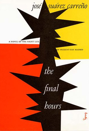
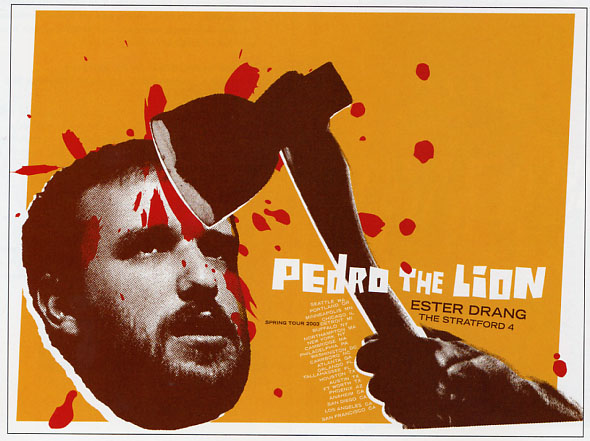
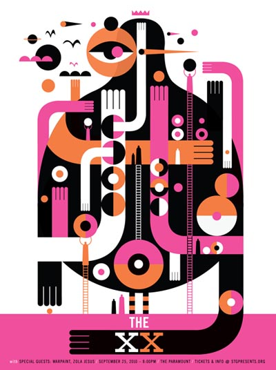
This piece juxtaposes radical abstract shapes
with the solitary figure
Note also the limited palette
Think about space and composition
Where will you put your elements?
How will you divide up the page?
Can you use space to enhance or
generate meaning?
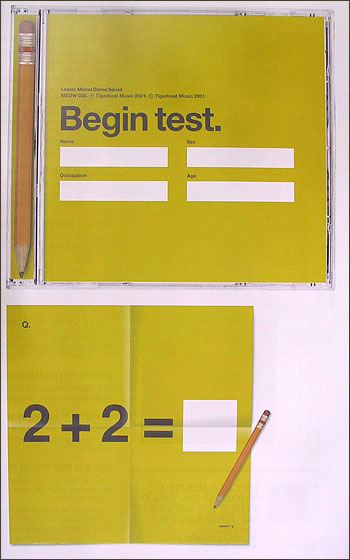
The concept itself can actually be minimal, in other words,
very "matter of fact" -- bare bones and logical...
Another example where the concept itself plays
with pure simplicity
So this has a deceptively literal concept, with
a deceptively simple design...
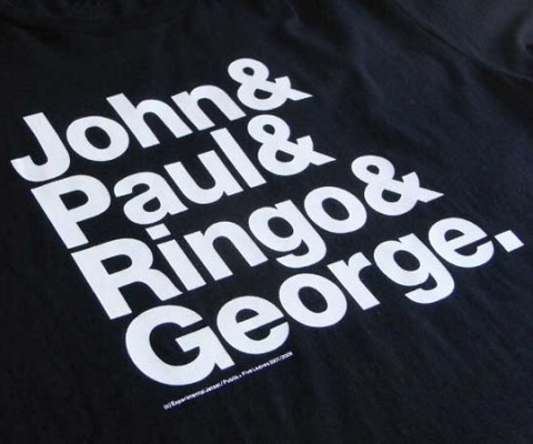
Here is the Beatles shirt mentioned in the last class -- it
takes the massive all encompassing presence of the
band, and reduces it to this simple list.
A bit ironic, perhaps?

Not something you can do for the project, but
you can see how it fits into the same vein
Patterns could be another area of exploration...
Gunnar Aagaard Andersen - 1955
Alexander Girard - 1952
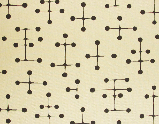
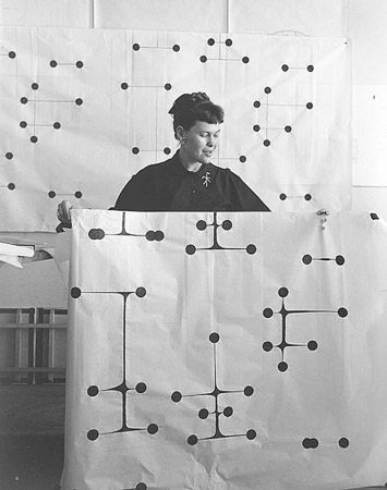
The "Dot" Pattern that defines a generation
Ray Eames - 1947
Alvin Lustig book covers:
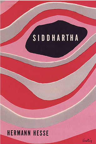
Pattern and text together
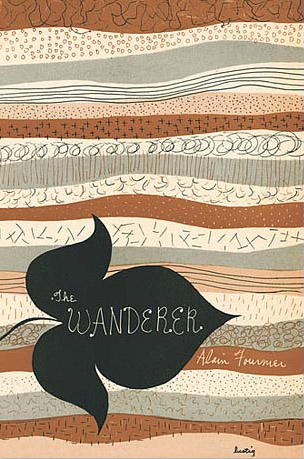
Reduced shapes and simple suggestions of texture
Note the framing and composition, as well as the
minimal palette
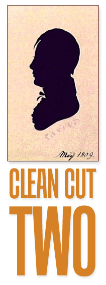
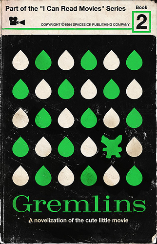
A rough cut-out look -- the "2" really makes the piece
along with that space below the title
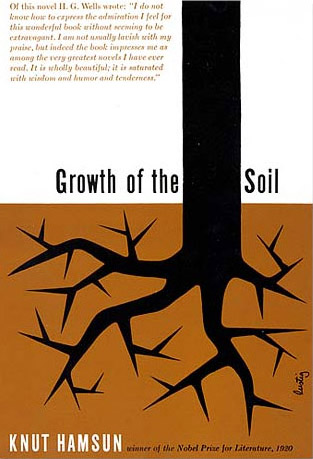
The roots could of course be photographically realistic --
why make them this way?
How does it actually add to the piece?
Note here the textures created in contrast to the
solid flat colors -- the type is "knocked out"
from the solid pieces
Vibrant and dynamic three-color piece
More recent...
Adams Morioka
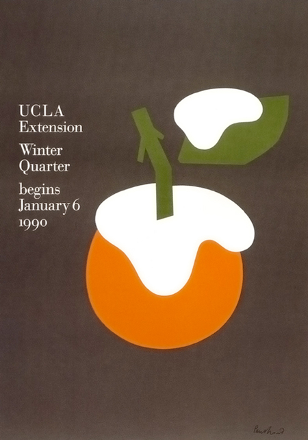
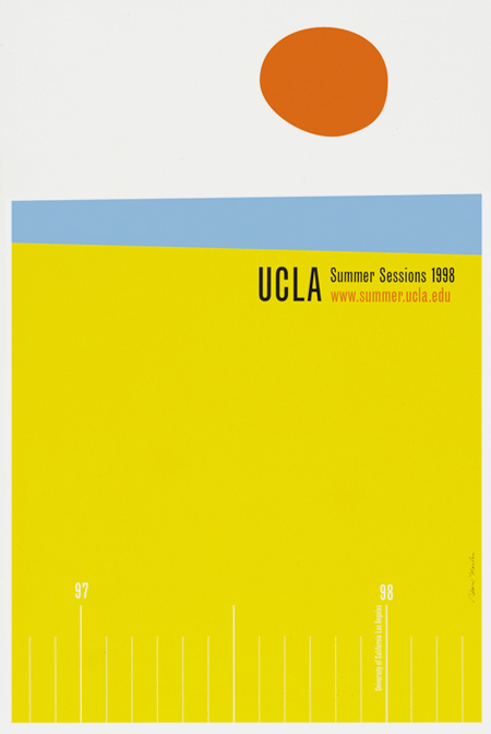
Another UCLA Extension catalog, this time Paul Rand
What would you do differently?
Does it need more? Is it poetically minimal?
Death Mask, 1958
Rand? No -- but "Rand-esque"
Jody Barton
Perhaps familiar?
Colorforms, 1959
Tongue-in-cheek -- a bit of humor perhaps standing in
contrast to the extremely minimal nature of the design
The text and colors are playful, in contrast to the
structured nature of the road
Note also the "translucent" overlay effects on
the text
More negative space -- the simple shapes actually
"suggest" a rooster, without anything there!
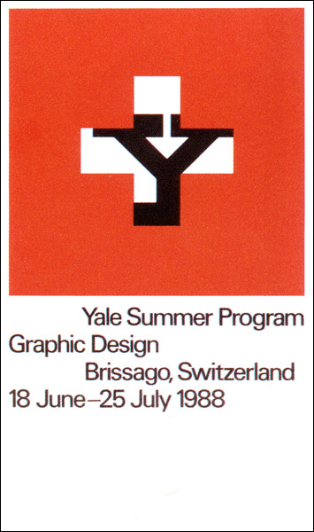
This piece creates a striking sense of depth with
the "masked" window and the "Y" that is
ultimately revealed
A "proto-animation" -- could be an approach to
consider in your project development
"Line art" could be an approach for your to consider
These pieces have a "Rand-esque" looseness to the drawing style
Then again, you may want to go with something that
has almost physical weight
CASE STUDY:
PENGUIN BOOKS
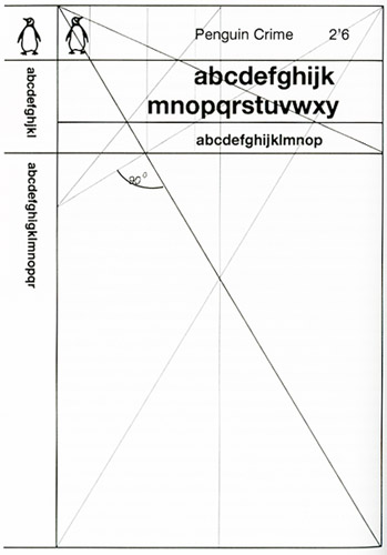
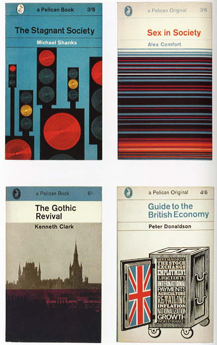
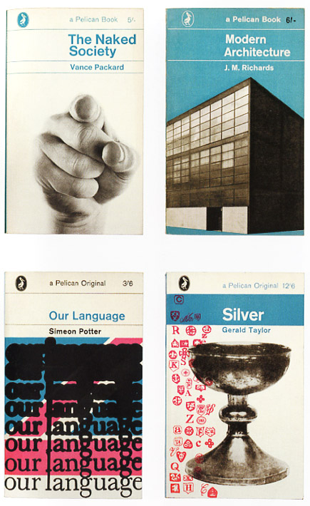
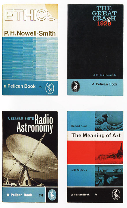
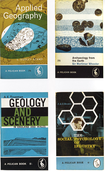
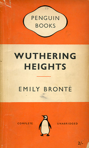
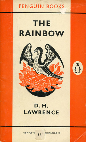
The "Marber Grid" - 1961
Romek Marber
Divides the page along striking and consistent angles;
creates a cohesive series with an open area for
unique and suggestive illustrated elements
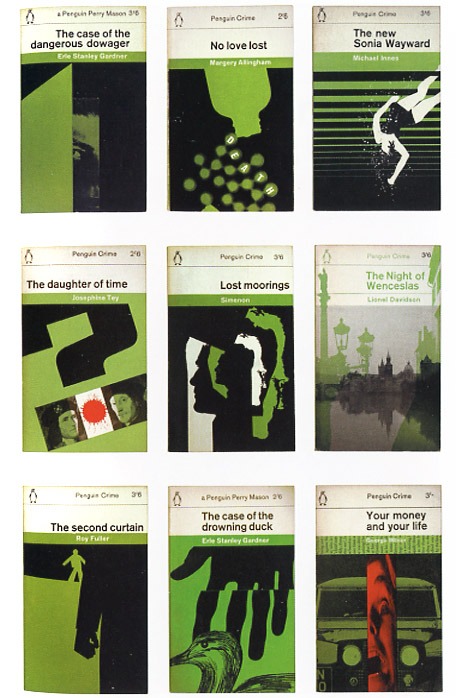
The Marber Grid in action...
(Note the palette)
Want to see more?
Check out the archive here
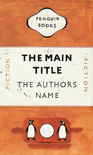
A few designs before the Marber grid:
The Original Early Penguin
The signature "Penguin" look has had a direct
impact on many designers:
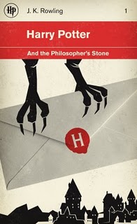
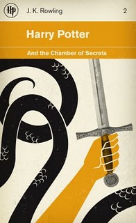
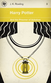
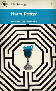
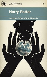
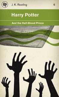
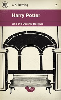
M.S. Corley's Tribute to Harry Potter
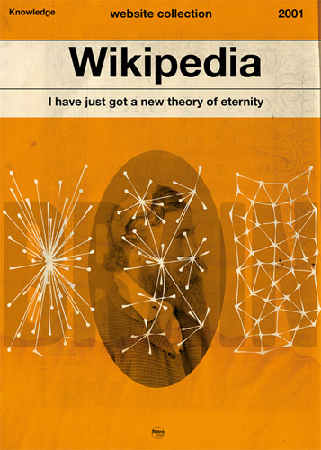
Retrofutur's "web-based" take on the Marber grid:
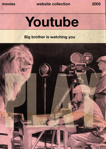
Of course, even films have been addressed in
a "Penguin-esque" approach:
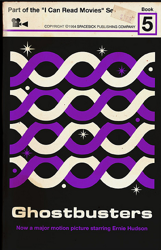
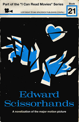

Down the road, once you break away from the page,
it is interesting to see how this aesthetic continues
to take shape...