
Some colors you may have uncovered
based on last night's reading:
| 1.
Poppy 2. Coral 3. Rust 4. Brick 5. Rose 6. Mauve 7. Magenta 8. Fuschia 9. Pumpkin 10. Garnet 11. Lapis 12. Azure 13. Periwinkle 14. Slate 15. Navy 16. Midnight 17. Teal 18. Turquoise 19. Cornflower 20. Heather 21. Lime 22. Puce 23. Emerald 24. Kelly 25. Olive 26. Moss 27. Sea 28. Chartreuse 29. Seafoam 30. Sage 31. Mint 32. Charcoal 33. Ebony 34. Khaki 35. Gold 36. Silver |
37.
Bronze 38. Brass 39. Copper 40. Iron 41. Eggshell 42. Ecru 43. Bone 44. Beige 45. Greige 46. Tan 47. Taupe 48. Chocolate 49. Blond 50. Honey 51. Ivory 52. Buff 53. Lemon 54. Cream 55. Burgundy 56. Peach 57. Hazel 58. Plum 59. Purple 60. Yellow 61. Red 62. Green 63. Blue 64. Orange 65. Cyan 66. Black 67. Brown 68. Amber 69. Burgundy 70. Umber 71. Sienna 72. Lavender 73. Lilac 74. Pigeon? |

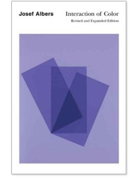
Josef Albers (1888-1976)

Vector drawing in the style of Albers
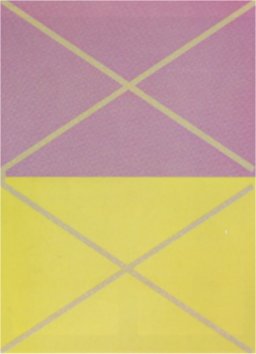
Color Test

FGA, 1968

I-SF, 1970

Never
Before, 1976
How much is color a part of
conditioning process?
    
|
 
  
|
(Fast food conclusions with research assistance from Art 423 Student Israel Laveaga)
What do colors really mean?
What do they suggest?
- - - - - - -
Concept Driven Color
As we have seen in any number of cases, interior design
is particularly affected by "romanticized" notions of color
(think about how many different types of "white" there are
for basic wall coverings), but there is a close connection
for us as graphic designers (and likewise in the first project).
Interface/Flor is a company that makes carpeted "tiles" which can
liven up your apartment, but more interesting is to see the concept
behind their color groupings/naming -- for instance:

House Pet™
THE LOOK : Whiskery and soft like wire-haired terrier.
Colorways from frisky to sophisticated.
THE FEEL : Think faux mohair.

Keep this concept-driven approach in mind
as we head into
the first project!
In-Class Production
(time pending)

Homework:
Bring in a design which somehow challenges our expectations
or sets up a "new" outlook.
Think about design as telling a story -- at first we are going
down one road, later we discover that we are going down a
totally different road!
In other words, instead of relying on things we "already know" the design
you bring in shows us something new; it plays with our expectations
perhaps showing something different about something we thought
that we knew...
Here is another example:

The example here is from Tortoise's 1998 album "TNT." If you consider the date, this came out right around the time CD burners were becoming widespread. The actual design has the initial look of being a crude drawing on some hand-made, hand-copied (or pirated) CD, yet this is actually a printed piece designed to emulate that effect. Thus we are taken down one road (low-tech pirate CD), when in fact the CD itself is impeccably mixed and mastered and wholly original. Final result -- expectations challenged, and an intriguing narrative diversion! (Many bands have since copied this concept). |
|---|