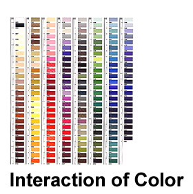
If one says “Red”
(the name of a color)
And there are 50 people listening,
It can be expected that there will be 50 reds in their minds.
And one can be sure that all these reds will be very different.
Even when a certain color is
specified which all listeners have seen
Innumerable times—such as the red of the Coca-Cola signs which
is
The same red all over the country—they will still think of
Many different reds.
Even if all the listeners have
hundreds of reds in front of them
From which to choose the Coca-Cola red, they will again select
Quite different colors. And no one can be sure that he has found
The precise red shade.
And even
If that round red Coca-Cola sign with the white name in the middle
Is actually shown so that everyone focuses on the same red,
Each will receive the same projection on his retina,
But no one can be sure whether each has the same perception.
When we consider further the
associations and reactions
Which are experienced in connection with color and the name,
Probably everyone will diverge again in many different directions.
What does this show?
First it is hard, if not impossible,
to remember distinct colors.
This underscores the important fact that the visual memory is very
poor
In comparison with our auditory memory. Often the latter is able
To repeat a melody heard only once or twice.
Second, the nomenclature of
color is most inadequate.
Though there are innumerable colors—shades and tones—
In daily vocabulary, there are only about 30 color names.
Open up Illustrator, create a new document,
and answer the following questions. We'll discuss your results as
a group...
(No need to print, I will come around and check this off at the beginning
of the next class!):
1A. Briefly
describe the earliest childhood memory you can recount; now consider
what single color you would most associate with the memory and try
to find it using the color picker in Illustrator.
1B. Using
the pen tool, draw a simple shape/silhouette that somehow relates
to this memory and fill the shape with the appropriate color. The
shape could be precise or abstract, the choice is up to you. (You
are welcome to use a photo reference if necessary, but please do
not use "livetrace".)

2A. Think of
your favorite pet from any point in your life (Dog, cat, fish, etc.)
and again create a simple drawing of a silhouetted outline of this
animal with the pen tool.

2B. Fill the
drawing of your pet with the color you think most relates to this
pet.

2C. Copy/paste
a version of your pet drawing and now change the color to reflect
a more metaphorical mood/character attribute.


3. Now think
of a favorite posession that you had as a child and again create a
simple drawing. This time create a three-color gradient that combines
the three colors you would most associate with this item.

4. Is
color memory really so difficult? Try to come up with what you think
is the precise CMYK value for Coca-Cola Red (don't cheat!).
5. Now
for a different challenge; can you name 30 different colors? List
as many colors as you can -- but try to avoid adjectival modifications
like "sky blue" or "baby-poo brown"
or "pea green." See how many you can list...
6. The
preface to the class discusses an attempt to define the color "white"
by comparing it to different objects (snow, albino rabbit, porcelain,
etc.). Try to come up with three things/objects you would reference
to define the color "green".
Why might your ideas for green be problematic?
7. Take
a look back at the "First Things First" Manifesto from the
last reading (here)
-- jot down at least ONE interesting bit of information
about ONE of the individual designers who signed
this manifesto. (Hint -- they're all interesting folks!)

